Vintage Stacked: A Bold Display Typeface for Digital Impact
There I was—midway through a redesign for a ceramicist’s portfolio site—staring at a hero section that felt polite, safe, and utterly forgettable. The client wanted “warmth with presence,” something that echoed the hand-thrown texture of her mugs but still held up on a retina screen. That’s when I dropped Vintage Stacked into the headline field. Instantly, the page exhaled. Not because it was loud, but because it carried weight—tall, confident letters stacked like well-fired kiln shelves, grounding the whole layout without shouting.
What Makes Vintage Stacked Stand Out in Web Layouts
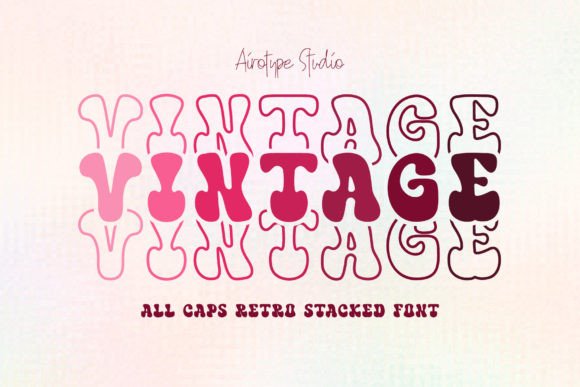
Vintage Stacked is a display typeface built for moments that need to land: hero headers, section titles, campaign banners, and brand signatures. Its charm lies in that thoughtful duality—vintage rhythm (slight irregularity in stroke contrast, subtle serif-like flares) meets modern structure (clean geometry, generous x-height, consistent spacing). Unlike many decorative fonts, it doesn’t sacrifice legibility for character. Each letter stands tall and distinct, even at smaller display sizes—crucial when testing responsive breakpoints.
Real-World Testing Across Devices and Contexts
I tested Vintage Stacked across three key scenarios: a boutique online store banner, a coaching website’s value proposition section, and a digital brand kit preview. On desktop, it performed beautifully over soft image overlays—its boldness cut through gently blurred backgrounds without needing excessive text shadow or contrast boosts. On mobile? It held up surprisingly well at 36px headline size, though I avoided dropping below 28px in portrait view. The stacking effect—which gives the font its name—adds vertical emphasis without crowding, making it ideal for tight hero spaces where horizontal width is limited.
One subtle win: Vintage Stacked scales gracefully in CSS with font-size and line-height. No awkward clipping or uneven letterfitting when resizing dynamically. And unlike some display fonts with aggressive kerning, its default spacing works out-of-the-box for most CMS editors and no-code builders—no manual tracking tweaks needed for basic use cases.
Where It Shines—and Where to Pause
This isn’t a body font—and it shouldn’t be. I tried it for a testimonial block (against my better judgment) and quickly reverted. Its personality overwhelms paragraph reading, especially at smaller sizes or on low-DPI screens. But as a display font? It excels in:
- Hero section headlines — especially paired with ample whitespace and a neutral sans serif for subheads
- Landing page CTAs — “Join the Studio” or “Shop New Arrivals” pop with intention
- Section dividers — “Our Process,” “Why Clients Return,” “Seasonal Collections” gain quiet authority
- Digital brand kits — it anchors visual identity without competing with logo marks
- Blog post headers — adds editorial distinction to long-form content without distracting from readability
Avoid using it for navigation labels, form inputs, alt text, or anything requiring WCAG AA compliance at small sizes. Its decorative nature means it’s best reserved for large, scannable, emotionally resonant moments—not functional UI.
Smart Pairing for Balanced Digital Typography
Every great display font needs a thoughtful counterpart—and Vintage Stacked pairs effortlessly with clean, humanist sans serifs like Inter, Poppins, or even system fonts like -apple-system. I used it with Inter (Regular and Medium) across the ceramicist’s site: Vintage Stacked for “Handmade in Portland” in the hero, Inter for everything else—body copy, captions, buttons, footer links. The contrast created hierarchy without friction. For more editorial sites—say, a slow-living blog—I’d lean into a warm serif like Literata or Crimson Text for body, letting Vintage Stacked anchor only the biggest moments.
It also works surprisingly well alongside subtle script accents—think a single word like “Studio” or “Est. 2021” in a delicate connected script beneath the stacked headline. Just keep it minimal. Over-pairing dilutes its impact.
Practical Considerations Before You Implement
Before dropping Vintage Stacked into production, check your license: commercial web use requires a webfont license (not just desktop), and not all vendors include WOFF2 or variable font support. I confirmed the version I used included WOFF2, SVG fallbacks, and full Latin character sets—including accented characters for bilingual clients. No ligatures or stylistic alternates cluttered the set, which I appreciated—this is a focused display font, not an ornamental toolkit.
Also worth noting: it loads quickly. At under 40KB for the full WOFF2 set, it didn’t budge our LCP metric during performance audits. And because it’s a single-weight display font (no light/medium/bold variants), it avoids complex font-display strategies—just one @font-face declaration, clean and stable.
If you’re building for accessibility-first interfaces or highly regulated sectors (healthcare, finance), test contrast rigorously—especially over images or gradients. Its thick strokes demand strong background contrast, but when met, it delivers clarity *and* character. That balance—between expressive design and digital practicality—is exactly why Vintage Stacked has earned a permanent spot in my type kit.